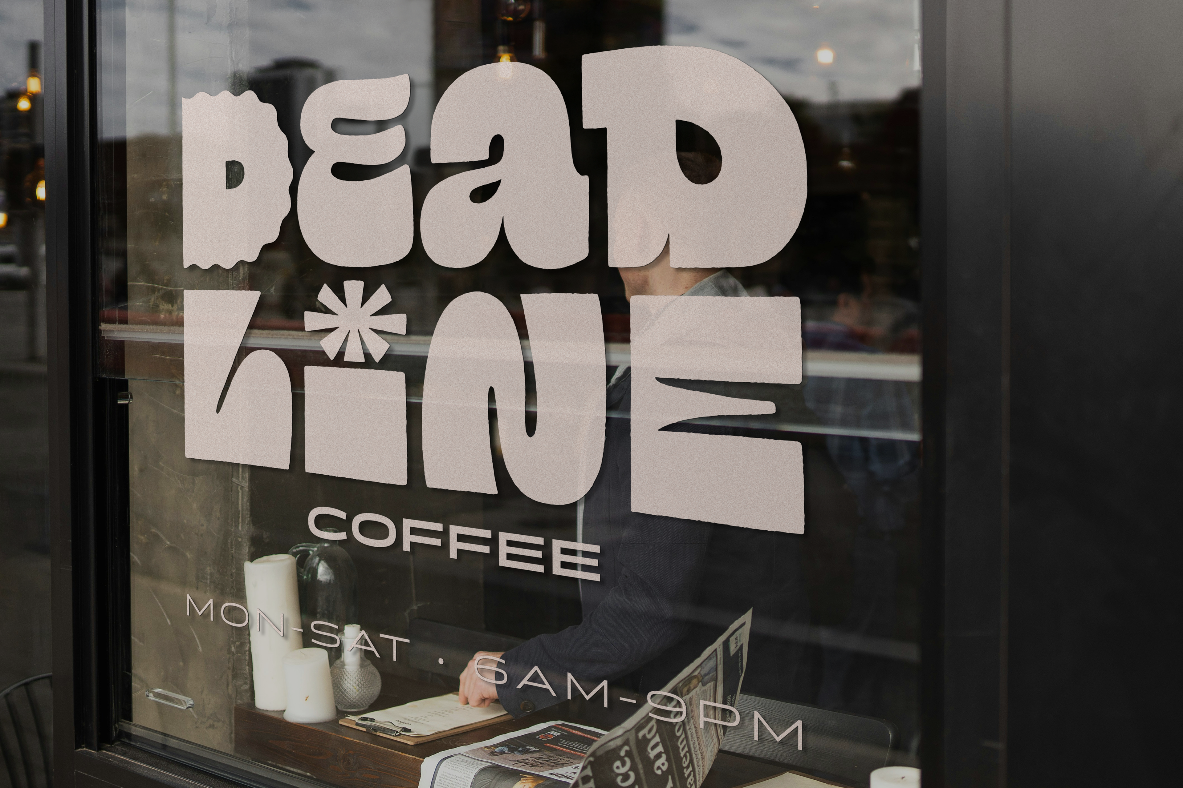
I’ve always wanted to design for a coffee brand, so I created Deadline Coffee as a self-initiated project to explore everything I love: lettering, illustration, and graphic design.
The concept behind Deadline Coffee is simple — it’s bold, and a little bit loud, the way I like my coffee. Through hand-drawn lettering and playful illustrations, I built a visual identity that I hope feels at the same time energetic and approachable.
This project was a chance to flex my skills across branding, packaging, and storytelling, while imagining a brand that could stand out on the shelf and street.
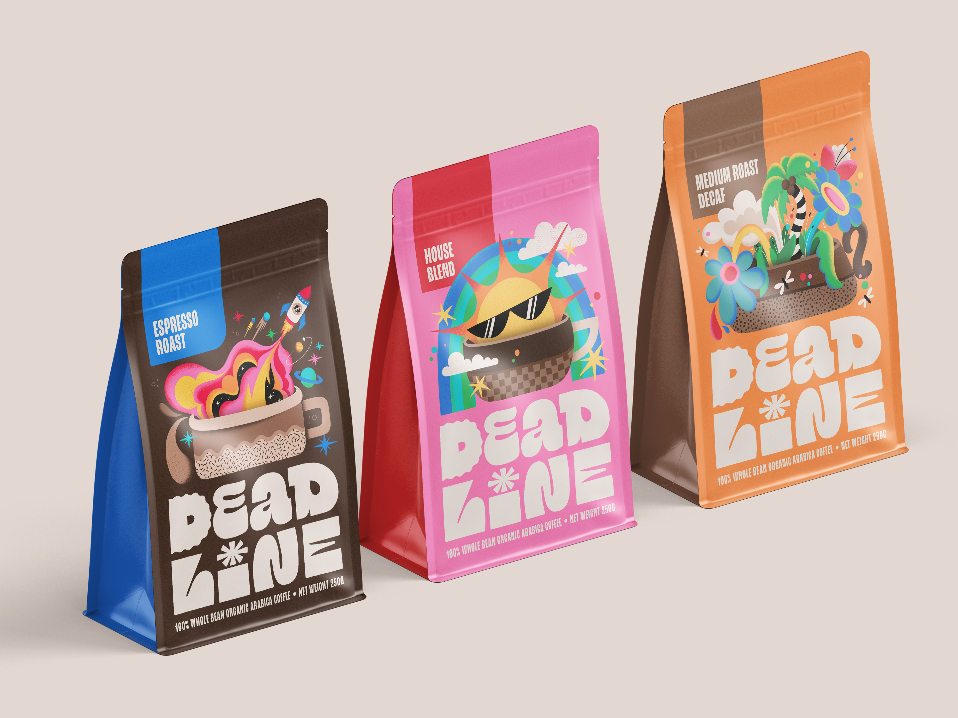
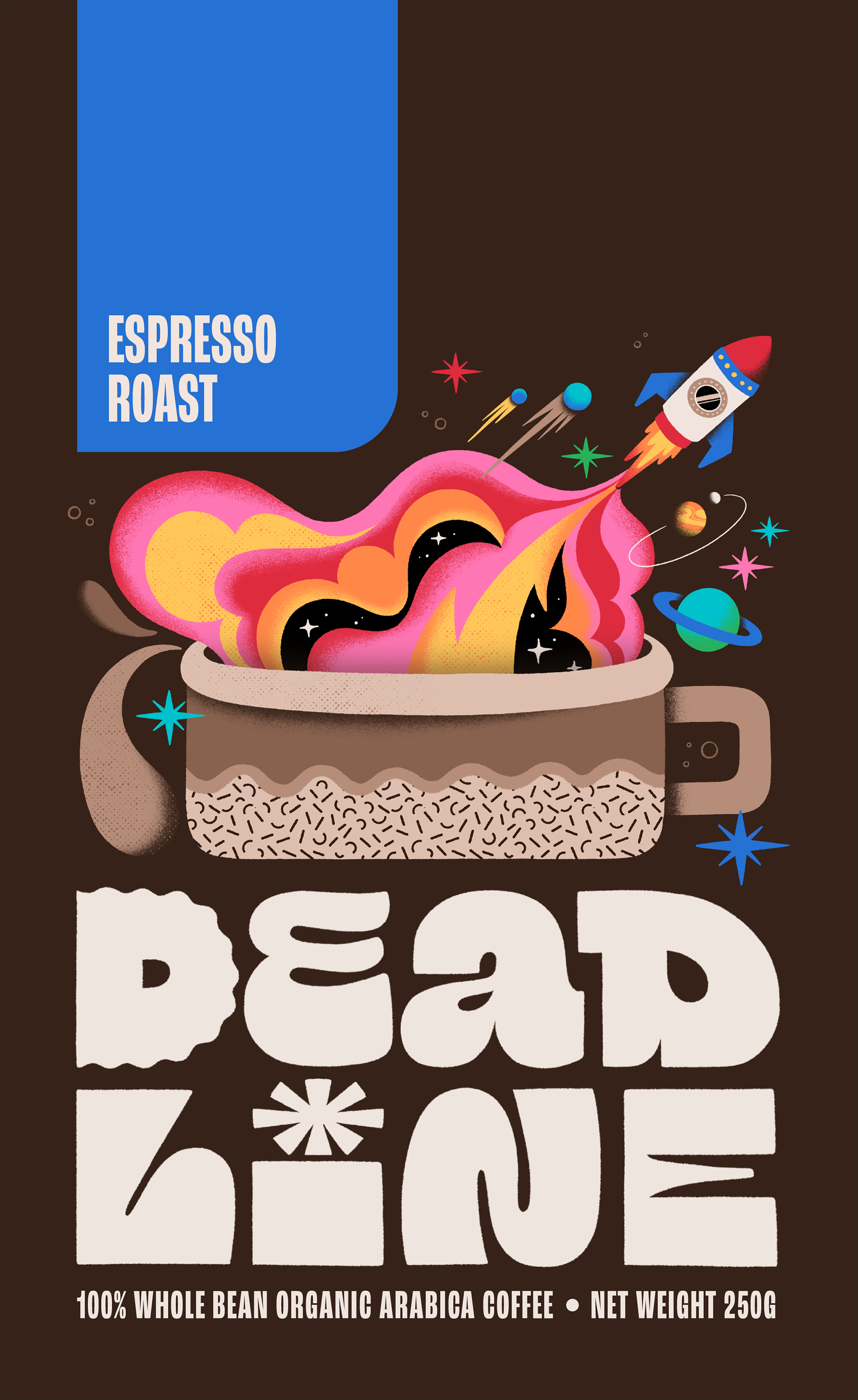
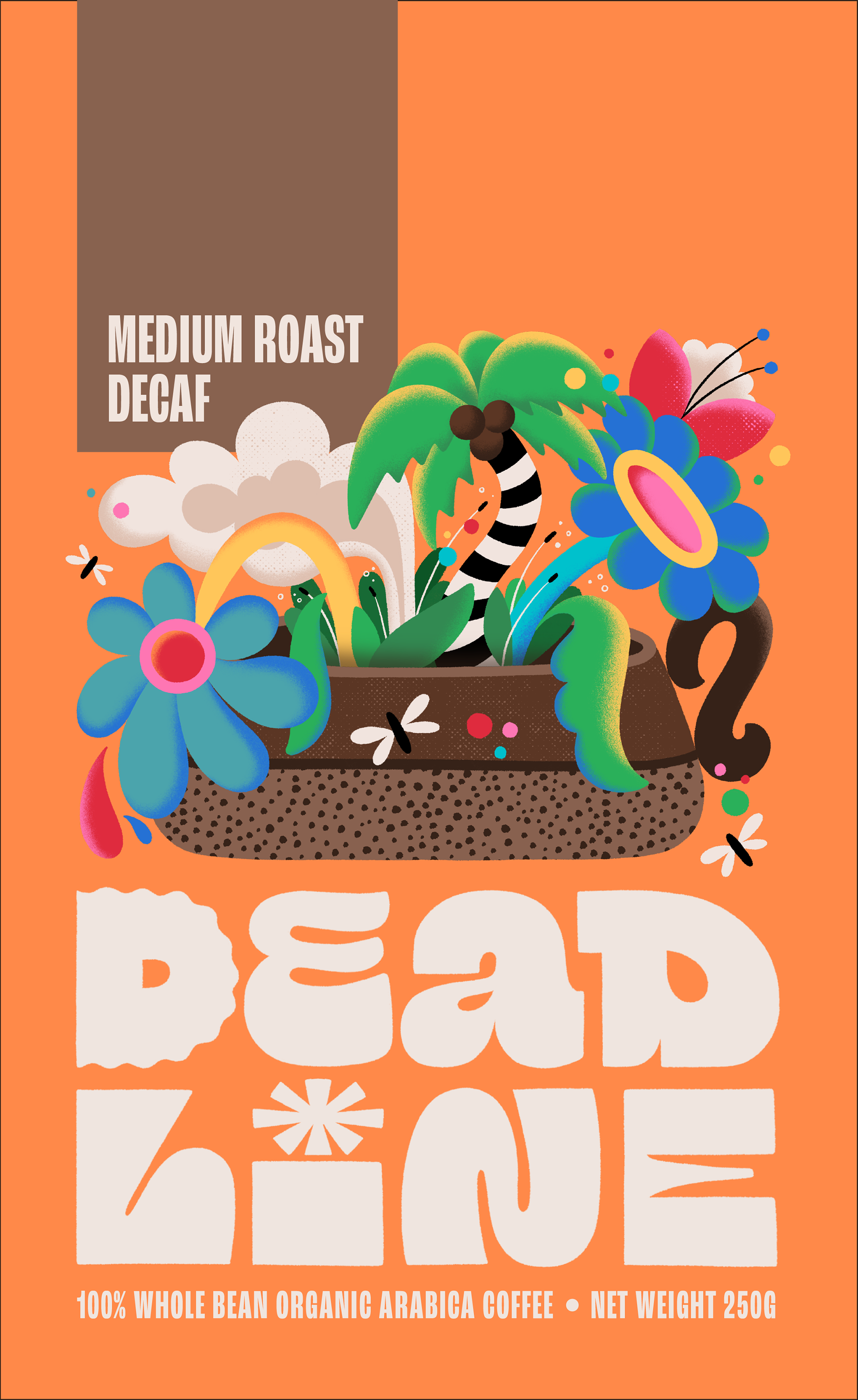
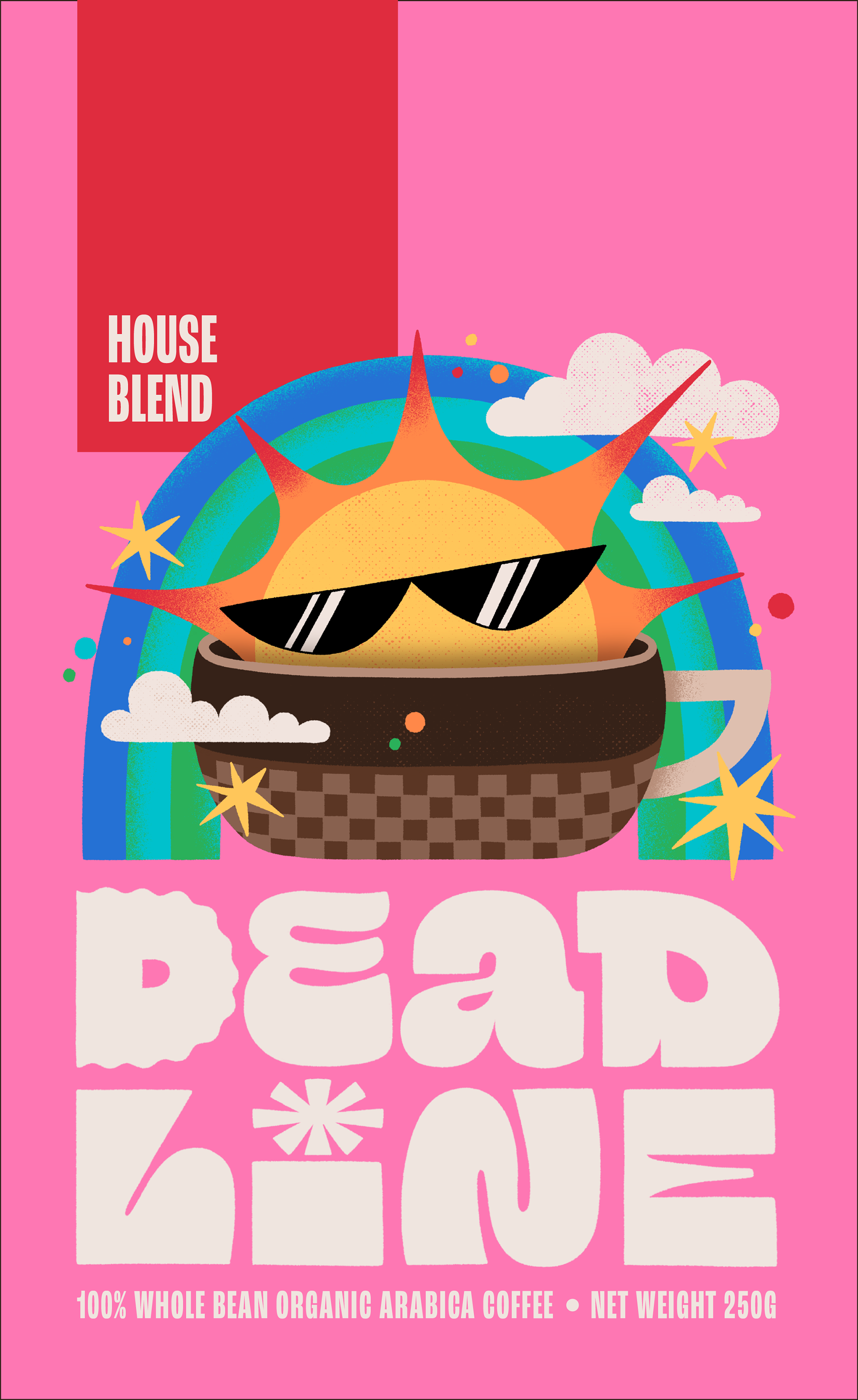
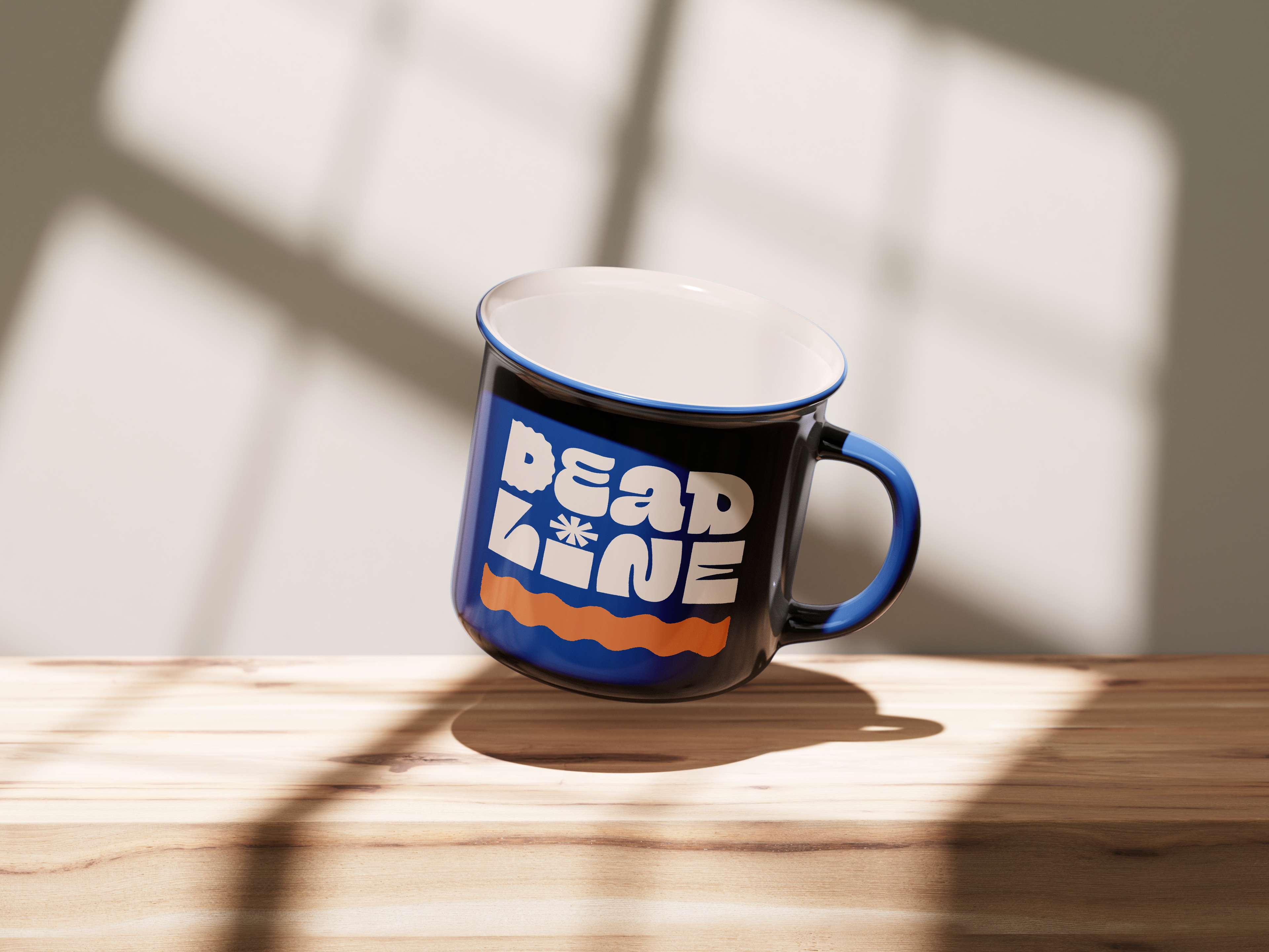
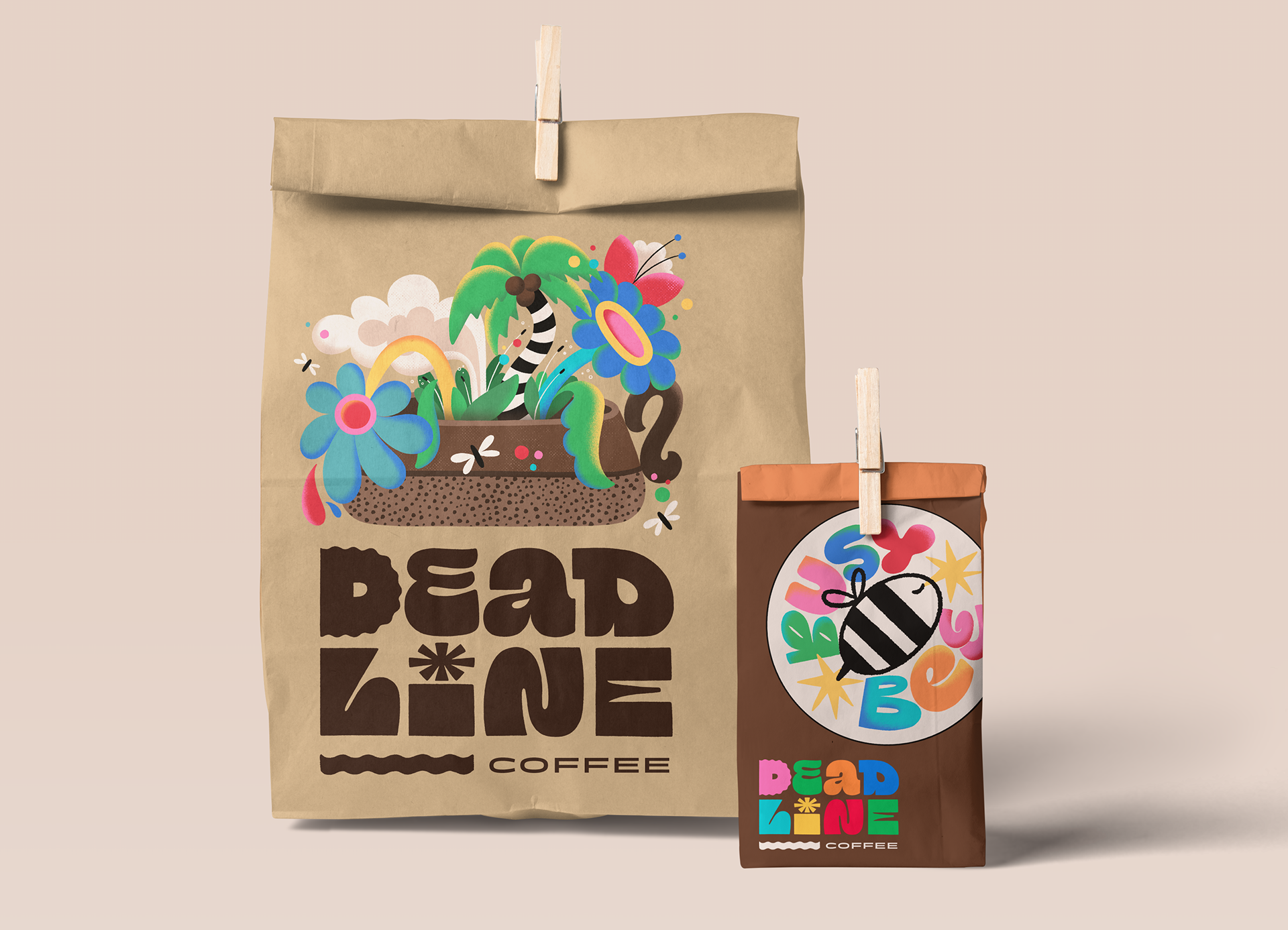
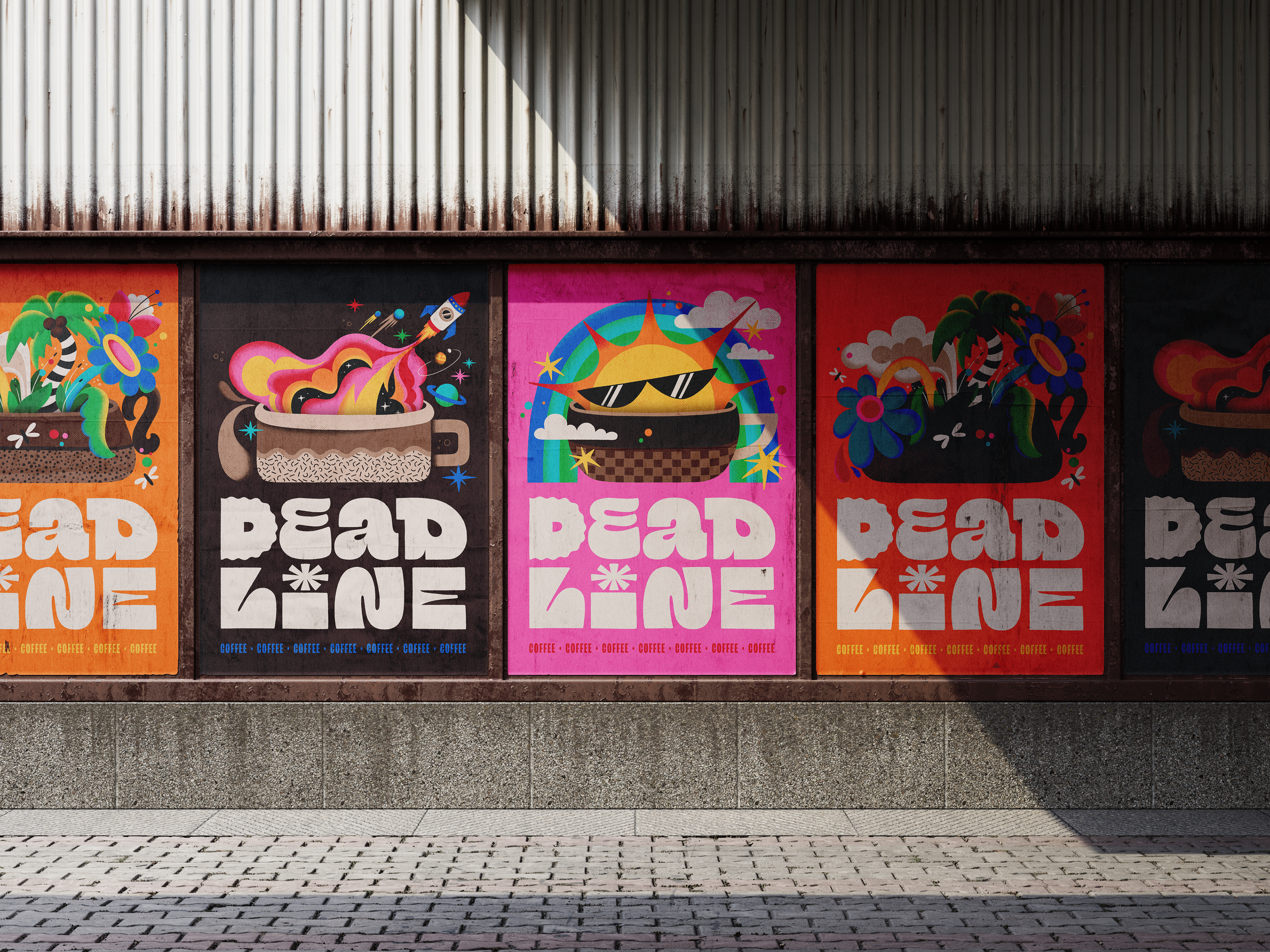
For the branding, I used coffee mugs as the foundation for the identity, a familiar everyday object that carries bold, unexpected visuals. Each illustration reflects what the coffee can do for you—a rocket to launch you into outer space, a sun to brighten your morning, or a lush floral jungle to bring you back down to earth. The goal was to make every package feel like a tiny story that stands out on the shelf, blending illustration, lettering, and graphic design.

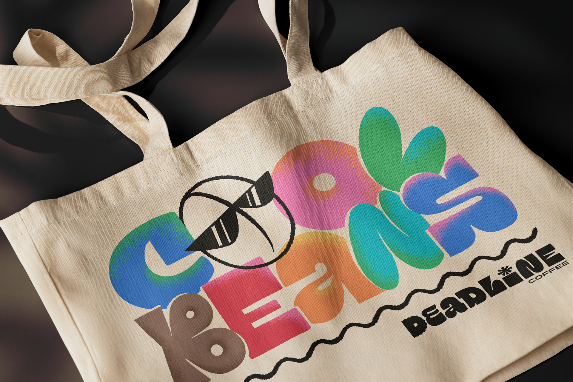
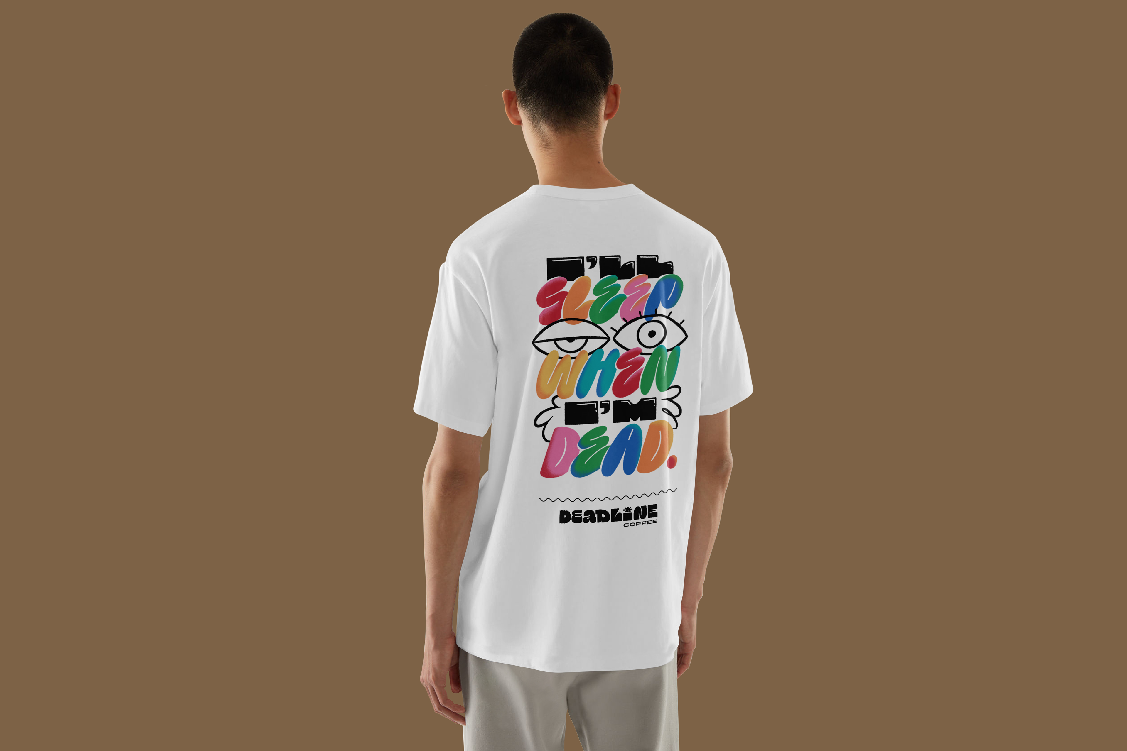
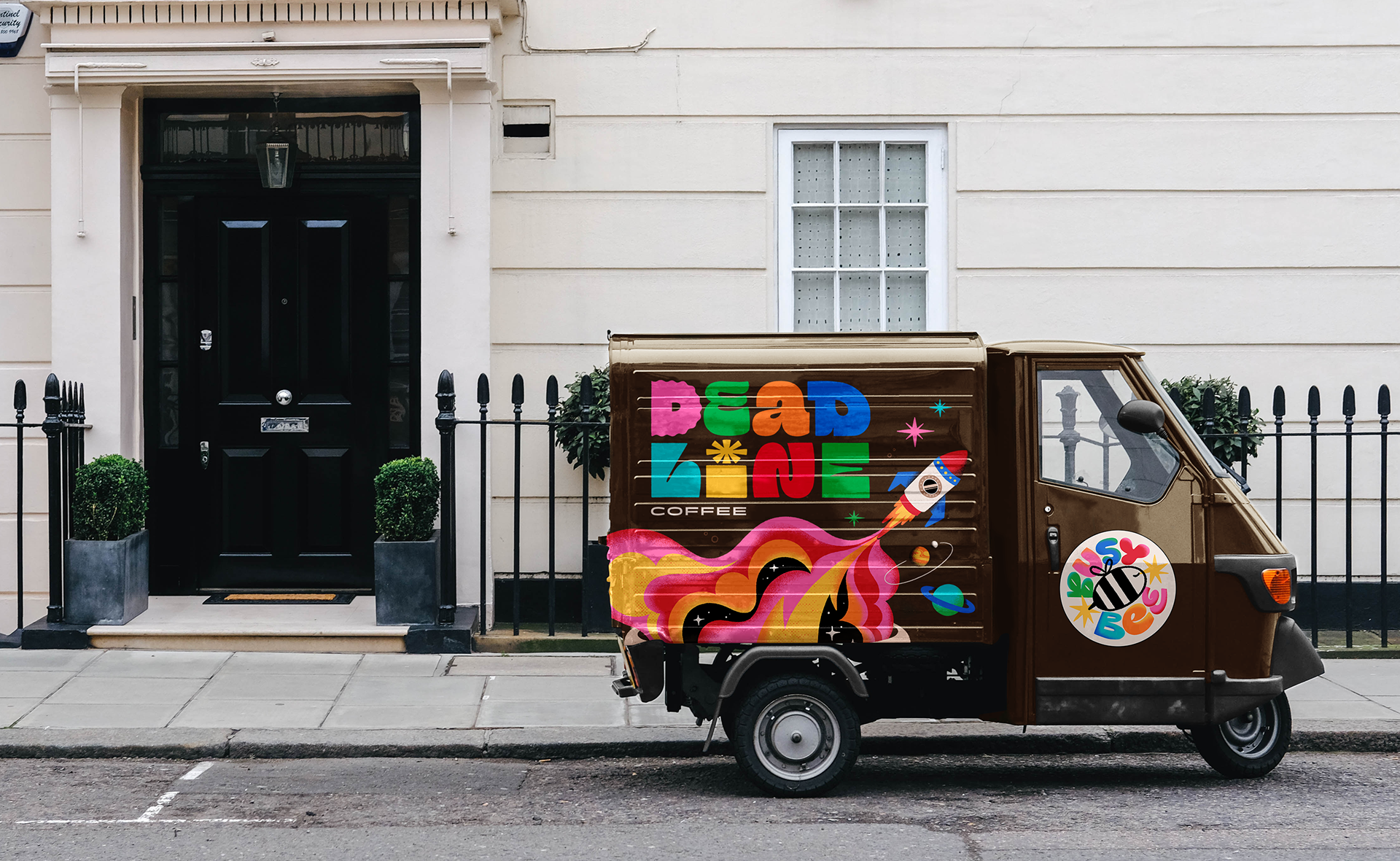
I also designed supporting pieces, like apparel and mugs, to demonstrate how the branding could expand beyond coffee packaging into other products. When building a brand identity, it’s important to think beyond the logo and core packaging, and envision how the visual language can adapt across different touchpoints and experiences.